If you’re looking to update your kitchen, you came to the right place. Money is tight for everyone right now, but sometimes you just want to make a few changes to improe your outlook.
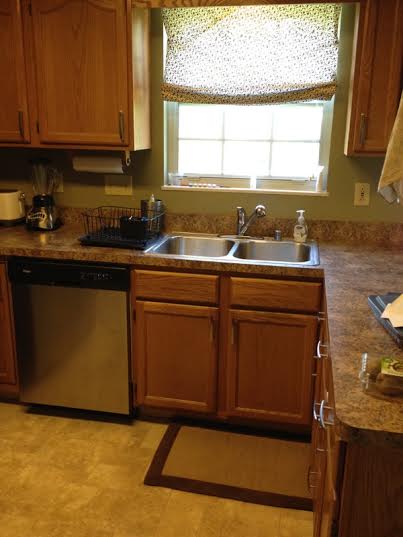
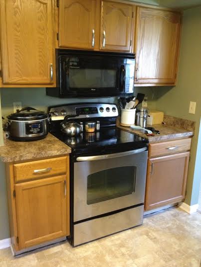
My friends Rachel and Micah recently scored a seriously good deal on an older home with great bones and they plan to gradually add character as time and their budget allows. Rachel asked me if I could help her plan a mini-remodel to freshen up their kitchen, which is part of an open floor plan that includes a dining and family room area in one large room. Though the space is huge and perfect for gathering, she thinks the dark colors and dated details are too drab for their vivacious family of five. With their $300 refresh-budget, here’s some changes I’d consider:
3 Options for a Budget Countertop Makeover:
Replace them!
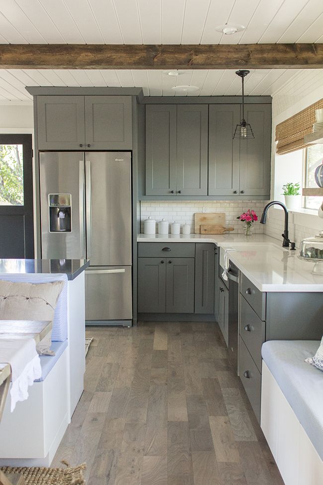
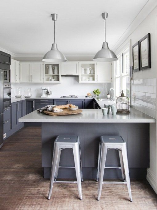
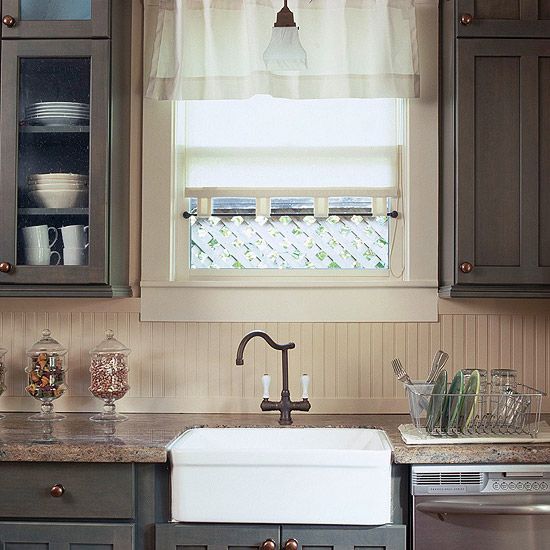
Ikea’s basic white countertop is only $39 for an 8 foot section, so Rachel and Micah could replace their countertops. This would be a large chunk of their budget but it would make a huge difference in terms of brightening up this space and creating a more modern look. The new laminate countertop would also be a low maintenance upgrade that would stand up to three kids. I think the white countertops would look beautiful with matte gray cabinets like the ones in the inspiration photo below.
Concrete over them!
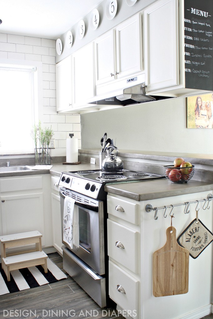
Sounds crazy, right? If you’re a fan of Fixer Upper, then you’ve probably seen a few kitchens with concrete countertops, which Joanna Gaines loves because of their “imperfectly-perfect” character. Taryn at Design, Dining and Diapers wrote a great post on how she used Ardex Feather Finish, which is just $17 a box, to transform her countertops. She says it is a messy but super-easy option for adding character to your space. Personally, I love this look and wish I had gone this route instead of installing butcher block countertops in our kitchen.
Live with the current countertops and save to replace them later.
There’s a lot to be said for buying what you love the first time rather than putting time, money and effort into a temporary solution. To make the most of the current countertops, I’d focus my attention on adding some character to the cabinets.
Adding Character to Builder-Grade Cabinets
Paint them!
The kitchen currently has a lot of cabinets which makes the space feel small and dark. I would suggest painting the upper cabinets white or even a very light gray and choosing a different color for the base cabinets. This will make the upper cabinets look less heavy. Here’s a great example:
Remove some doors!
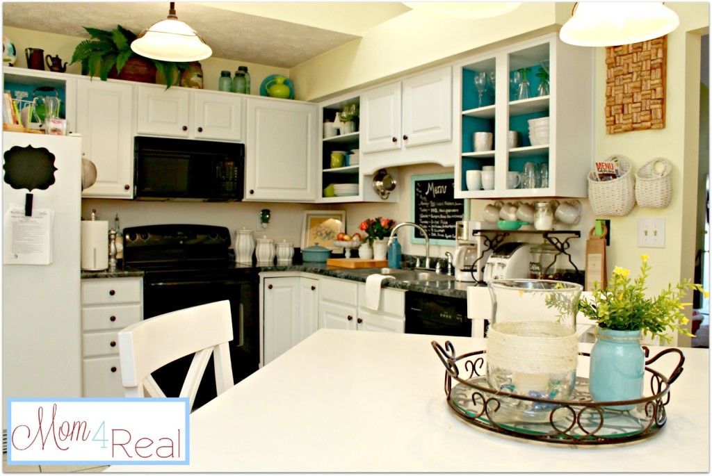
Because they have so many cabinets, removing a few select doors may make the space feel more airy. I love how Jessica at Mom 4 Real created interest by taking off a door here and there to reveal pops of color.
The best place in their kitchen for removing doors to create interest would be near the stove. Rachel loves baking and if she removed the doors on the upper cabinets, this area would make an adorable display space for her mixing bowls, jars of muffin liners, measuring cups, cake plates or baking goodies.
Bold Backsplashes on a Budget
Painted Glass
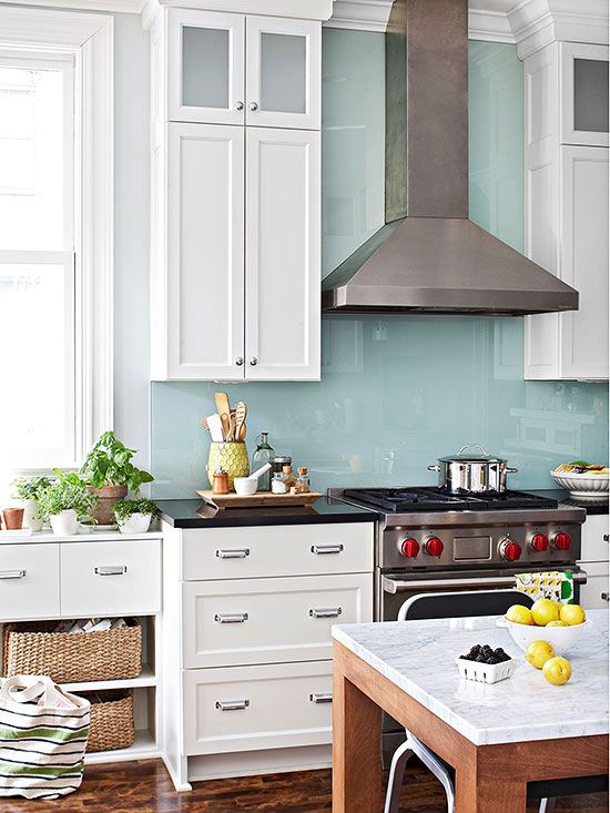
This would take a little research in terms of contacting the glass cutting department at Lowe’s or local glass cutters to get estimates but a painted glass backsplash on the wall behind the sink would make the kitchen look so bright and clean. I’m sure there are ways to do this without breaking the bank.
Beadboard
A beadboard backsplash would be cozy and inexpensive. Here’s a tutorial for installing one for around $30.
The Details
Bamboo Shade
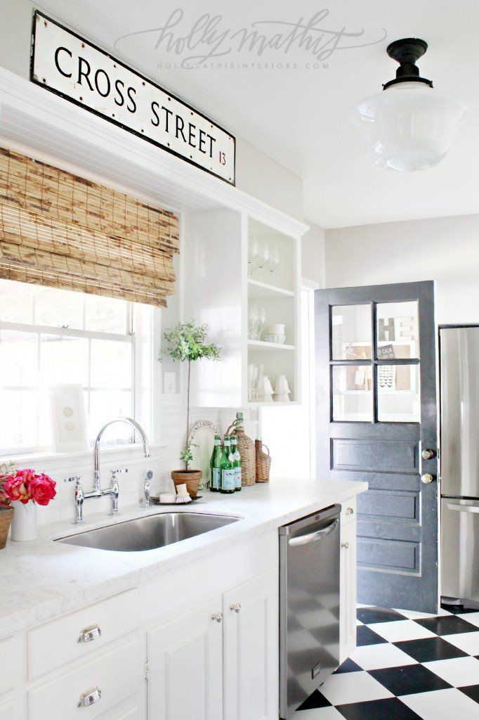
I’d swap out the kitchen curtain for an inexpensive bamboo shade to add a little texture.
Natural Touches
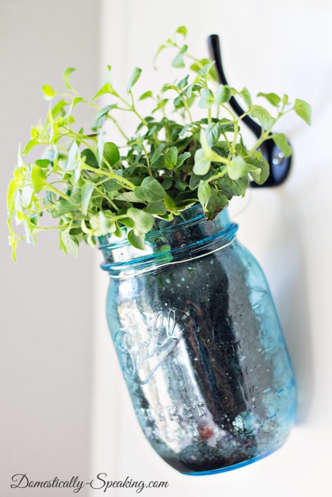
A simple way to update your kitchen on the cheap would be adding some natural touches. I’d take advantage of those cabinets near the window to hang some Mason jar planters with kitchen herbs.
Have you tackled a kitchen makeover on the cheap? Do you need to update your kitchen? Do you have any other ideas for Rachel?

